Henry Holland Translates Ceramics Into Wallpaper for Harlequin
Henry Holland's Harlequin collection turns handbuilt ceramic patterns into wallpapers and fabrics, with four fabrics named after homes he shared with his husband.
Programme
- Henry Holland created a wallpaper and fabric collection called Harlequin x Henry Holland for luxury furnishings company Harlequin.
- The collection includes four fabrics: Southborough, Elsworthy, Great Hey and Blenets Check Mini, each named after a former home of Holland and his husband.
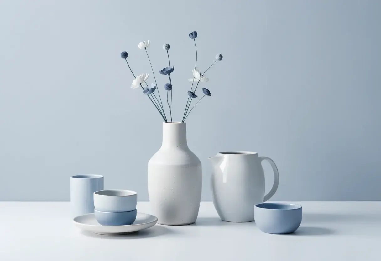
- The patterns derive from nerikomi, a Japanese pottery technique of layering and slicing coloured clays.
- The colour palette references unglazed ceramics for pastel tones and glazed earthenware for bolder colours.
- Archive prints from Harlequin's parent company Sanderson were reinterpreted within the collection.
Designer Henry Holland has launched a wallpaper and fabric collection for luxury interior furnishings company Harlequin, built directly on his work as a ceramicist. The collection, titled Harlequin x Henry Holland, draws on two sources: the archive of Harlequin's parent company Sanderson, and Holland's practice of nerikomi, a Japanese pottery technique.
"The starting point for the collection was our ceramic work," Holland told Dezeen. "We used the organic patterns and forms created in our handbuilt work as the starting point, and then similarly we built the colour palettes around the clays that we use to create our pieces."
"To add further depth and range to the collection, we also delved into the incredibly rich archive that the Sanderson group have across all of their brands and reinterpreted some archive prints that felt like the right additions to the collection," he added.
What does the collection contain?
Four distinct fabrics anchor the range: Southborough, Elsworthy, Great Hey and Blenets Check Mini. Each is named after one of the homes Holland and his husband have lived in.
"We created a really autobiographical narrative by naming the patterns and pieces in the collection after homes that my husband and I have lived in through our lives," Holland said.
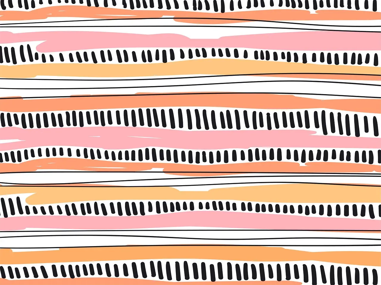
The patterning varies sharply across the four. Blenets Check Mini carries a checkerboard motif, Elsworthy a moiré-style pattern, Southborough chevrons and Great Hey a ladder design.
How did ceramics become fabric?
For Holland, the shift in scale from hand-held object to entire rooms was the point. "For me, the collection is really about taking the language we have developed through ceramics and allowing it to live on a completely different scale," he said.
"At the studio we make objects that sit within a room, whereas with Harlequin we suddenly had the opportunity to take those patterns, colours and textures and make them become the room," he added.
The nerikomi technique itself mapped naturally onto textile production. "With nerikomi, the pattern isn't something that is applied to the surface afterwards – it is created through the material itself by layering, compressing, slicing and rebuilding different coloured clays," Holland explained. "There is always this balance between control and chance, which is something I love about the process."
Working with the Harlequin team, he isolated details from ceramic surfaces and scaled them up. "Some tiny detail from a ceramic piece can suddenly become this huge, immersive pattern across a wall," he said.
Where do the colours come from?
The palette splits into two registers, both drawn from pottery. Pastel tones of chocolate and moss take their cue from unglazed ceramics; the bolder colours reference glazed earthenware.
"We were able to split the palette into more subdued, almost pastel tones, taking our lead from our unglazed ceramics, and then a bolder level of colour where we used our glazed pieces as the reference," Holland explained. "It was really important to me that, even though we were translating the work into completely different materials and applications, everything still felt very rooted in the studio and recognisably ours."
How should designers use it?
Holland wants the pieces layered freely rather than matched. "I don't think there should be too many rules around how it is used," he said. "One of the things we really wanted was for the collection to have enough cohesion that you could layer different elements together without everything having to match perfectly."
The colour stories run throughout, allowing a tone from one wallpaper to echo through a quieter fabric elsewhere in a room. "I think interiors are much more interesting when there is that kind of tension," he said.
The collaboration itself was iterative. "It was a very genuine back-and-forth process," said Holland, who rejected simply handing over ceramic patterns for conversion. "The interesting part was bringing together what we know about ceramics and pattern at Henry Holland Studio with Harlequin's incredible knowledge of textiles, wallpaper, colour and interiors."
"I think the best collaborations happen when both sides bring something to the project that the other couldn't necessarily achieve alone," he said. The collection now stands as a template for how a ceramics studio's language can be scaled into full interiors — and for how archive houses like Sanderson can refresh their holdings through contemporary makers.
Original: henryhollandstudio.com
More from Elena Vasquez
Show full bio
Senior reporter covering technology and product news in arts in the broadest sense at Arts & Voices.
844 articles